

If your website is feeling more like a glorified portfolio page that looks really lovely, but it’s booking… that’s a big problem.
As a photographer, you want your website to work for you and help book more clients and a little strategy can go a long way.
The truth is… your website should guide, convince, and convert and not just showcase your work.
This starts with choosing the correct pages built the right way.
These 5 website pages are the must-haves for every photographer looking to get more inquires in your inbox
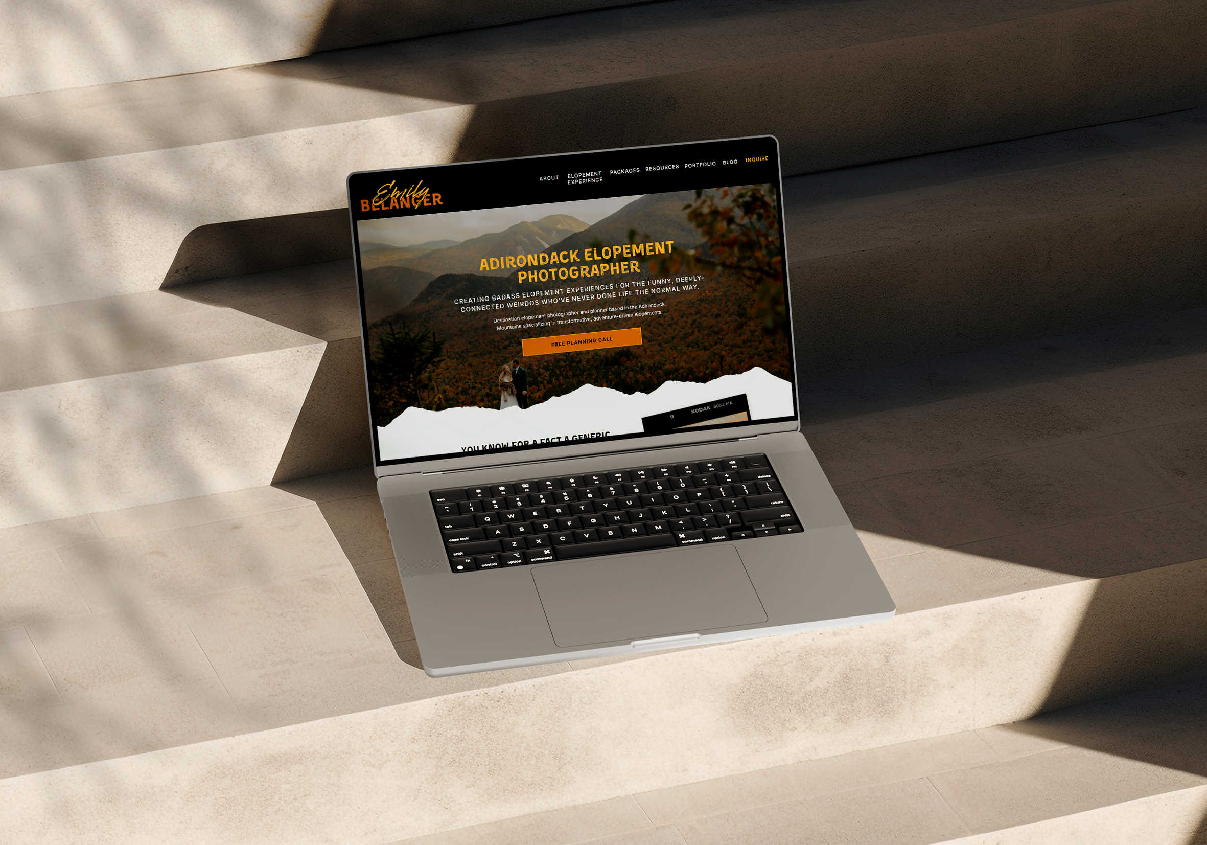
Homepage: The Attention Grabber
The homepage is the first impression. This isn’t just a welcoming page… this should be your silent salesperson that helps navigate to conversion.
Within seconds, your dream client should know:
– What you do
– Who you do it for
– Why you’re the one for them
– Where you serve
What to include:
- A clear, bold headline (save the vague artsy phrases for later. Don’t have them guessing at what you mean)
- A quick intro to your services/what you do.
- Featured work or a preview to your portfolio
- Social proof (reviews, testimonials, and any acknowledgements/awards)
- Multiple CTAs (call-to-actions) buttons. I.e. “Book your consultation”
PRO NOTE: If someone lands on your site and has to search for what you offer and where you offer it, you’ve already lost them. Make it incredibly easy for them to know you’re what they’re looking for.
About Page: The Trust Builder
Spoiler Alert: People don’t just hire photographers for beautiful photos.
They hire someone they feel that connection with. Someone they can trust. Some that they like.
Your about page is where you build trust and connection.
What to include:
- Your story (but framed around your ideal clients, not just you)
- Why you do what you do
- Your approach to sessions (That’s more than the style you provide. What experience do you provide?)
- Personality and values (this is where you highlight who you are and what you stand for)
- And photos of you! (Yes, this matters! You may be more comfortable behind the camera, but your clients want to see you)
The energetic shift:
This is NOT “Here’s my whole life story”
This IS “Here’s why working with me feels different”
Portfolio Page: The Visual Proof
Your portfolio should be more than a photo dump.
This is the place to provide a strategically curated experience that makes your dream clients realize you’re their dream photographer and think to themselves “I can see myself in these!”
What to include:
- Your best work (think: quality > quantity)
- Organized galleries (If you have multiple niches, you should have galleries for each)
- Consistent editing style
Top 2 Common Mistakes:
1. Uploading everything instead of focusing on what actually sells your work (they don’t need to see every shot you did for every session)
2. Having a huge wall of photos and no direction. (If they’re scrolling, scrolling, scrolling… it’s too much and they’re likely not seeing a good variety of your work)
Services Page: The Deal Sealer
Skip the “Investments” page and go into what really matters… what you’re offering (that’s more than what they’re paying).
If your services page is just a pricing list… this isn’t actually helping you make sales.
This page should be your ultimate sales person. This should be doing the following:
Answering any questions they have about your services
Handle any objections they may have
Make booking feel like the most obvious next step
What to include:
- Clear descriptions of each offering
- Who each service is for
- Starting prices (Yes, you NEED to give at least the starting price or people assume you’re out of range)
- What’s included/what the deliverables are
- The experience of working with you (social proof is always helpful)
- FAQs
- A strong CTA (call-to-action)
NOTE TO SELF: People aren’t just buying photos anymore… they’re buying an experience! Sell the experience!
Contact Page: The Conversion Moment
This is the end game. The whole point of your website. This is where the magic happens… or where it falls flat.
If your contact page is confusing, overwhelming, or cold… people are going to leave.
What to include:
- A simple, easy to fill out inquiry form
- Clear, expectations (response time, what the next steps are, what to do in the meantime)
- A friendly inviting tone
- Optional FAQs to reduce hesitation
HOT TAKE: The longer and more complicated your form, the fewer inquiries you’ll get. However, this could save you time with inquiries that aren’t fully ready for your magic.
Let’s be real
Your website shouldn’t just exist; it should be working for you.
When these 5 pages are done right, your site becomes:
– A lead generator
– A trust builder
– A 24/7 sales machine
And suddenly, you aren’t hustling and grinding for clients… they’re coming to you.
Want a website that actually books?
If your current site isn’t doing its job, it might be time for something better and way more strategic.
Because your work deserves more than a “this is really cute” website. It deserves a website that converts.


Comments +