
Your brand is always giving. Whether in a good or a bad way, your brand is giving. From the fonts you use, the way your website makes people feel, your visuals, the words you use, and various other choices, silent signals are either pulling in your dream clients with total alignment or it’s pushing them away (spoiler: they aren’t coming back if it’s the latter).
Let’s break down the five most common brand signals and what they might be saying behind your back:
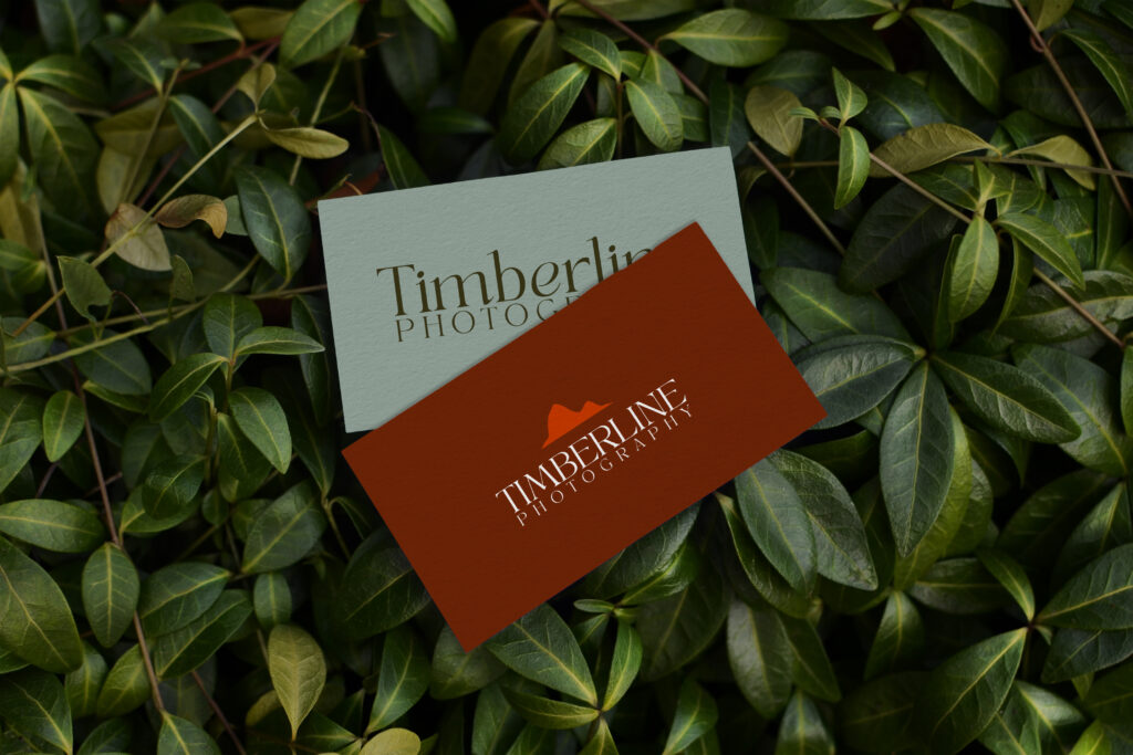
- Your Color Palette:
What it’s saying: Bold and vibrant? Playful and creative? Muted and minimal? Sophisticated and calm? Or dull, boring, and too understated?
What misalignment looks like: A fun, quirky service paired with soft beige tones that scream “neutral luxury” instead of “big personality”.
What alignment looks like: Colors that mirror the energy you want clients to feel when they land on your site or scroll your socials. - Your Typefaces and Fonts
What it’s saying: Sleek, serif fonts give timeless, classic, editorial vibes; whereas handwritten or funky fonts suggest approachable or even whimsical.
What misalignment looks like: Too many fonts (think 5+ mix and match typefaces) which is giving unorganized and confusing. We won’t even get started on the inconsistency of font sizes.
What alignment looks like: Typography that reflects your positioning and brand voice without sacrificing legibility or cohesion. Limiting to 2-4 max typefaces that have a specific job throughout your site. Think one for each: title font, header font, subheader font, and paragraph font. - Your Website Flow and Layout
What it’s saying: Is it easy to navigate, or do website visitors have to work to find the info they need? Is the copy easy to skim, or does it feel overwhelming and wordy as hell?
What misalignment looks like: A brand with clunky navigation or confusing user flow. Imagine a map with too many details and all you need are basic directions.
What alignment looks like: A site that guides visitors with intention and clearly shows them who you are, what you do, and how to take action. - Your Photography and Visuals
What it’s saying: Are your images custom, polished, and cohesive? Or are they generic, pixelated, unclear, and totally all over the place in terms of vibes?
What misalignment looks like: High-ticket offers paired with low-res selfies or inconsistent imagery.
What alignment looks like: Imagery that feels cohesive and on brand. This helps build trust and emotional connection. - Your Brand Voice
What it’s saying: Whether your tone is cheeky, fun, warm, direct, poetic, down to earth, or polished/professional, your tone is creating a vibe before anyone ever hits ‘book’.
What misalignment looks like: A friendly, fun business using drab, corporate copy that doesn’t reflect their personality.
What alignment looks like: A voice that mirrors how you show up in real life. Being able to connect with the right people in a way that feels genuine to who you are and not forced and rehearsed. People can smell fake from a mile away.
The bottom line?
Your brand is always communicating. The question is: is it aligned with who you really are and who you’re trying to attract?


Comments +